
How to make a choropleth map from Excel or CSV
A choropleth map colours each country, state or region by a value from your data. Here's how to get from a plain spreadsheet to a clean, readable map – and the mistakes to avoid along the way.
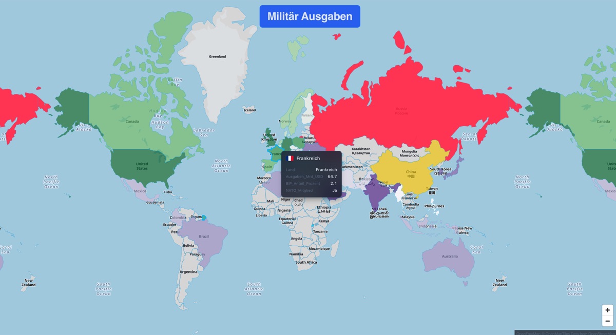
What is a choropleth map?
A choropleth map (also called a filled map or thematic map) shades every region of a map according to a number: unemployment by state, sales by country, emissions per capita. Darker or more intense colours mean higher values, so regional patterns jump out at a glance.
Choropleths work best for rates and ratios – values per person, per square kilometre or as a percentage. For raw totals such as population or revenue, proportional bubbles are usually the more honest choice, because large regions would otherwise dominate the picture simply by their size.
Step 1: Prepare your spreadsheet
You need one row per region and at least two columns: one that identifies the region and one with the value you want to map.
| Country | ISO3 | Value |
|---|---|---|
| Germany | DEU | 1.5 |
| France | FRA | 2.1 |
| Japan | JPN | 1.1 |
| Brazil | BRA | 1.2 |
- Use codes where you can. ISO 3166 country codes (DEU, FRA, USA) match far more reliably than names, which come in many spellings ("Côte d'Ivoire", "Ivory Coast").
- Keep numbers numeric. Remove units and thousands separators from value cells, and use one decimal format throughout the column.
- Normalise if needed. If you map totals, consider adding a per-capita or percentage column and mapping that instead.
- One value per region. If your data has several rows per region (for example per month), decide whether to map the sum, the average or the latest value.
Step 2: Import the file
In Plenum Atlas, drag your .csv, .xlsx or .xls file onto the map. The app detects column types automatically – country names, ISO codes, coordinates and numeric values – so in most cases there is nothing to configure. You can load several data sources into one project and show them side by side.
Want to try this without installing anything? The free Plenum Atlas web demo runs in your browser.
Step 3: Add a choropleth layer
- Add a Choropleth layer and pick the base geography – world countries, continents, European countries, German federal states or US states are built in. Plenum Atlas ships with 21 shapefiles, and you can upload your own GeoJSON or Shapefile.
- Choose the value column you want to colour by.
- Pick a colour palette. Use a single-hue or sequential palette for values that go from low to high, and a diverging palette only when there is a meaningful midpoint (such as zero growth or a national average).
- Check the legend and hover over a few regions to make sure the values landed where they belong.
Step 4: Make it readable
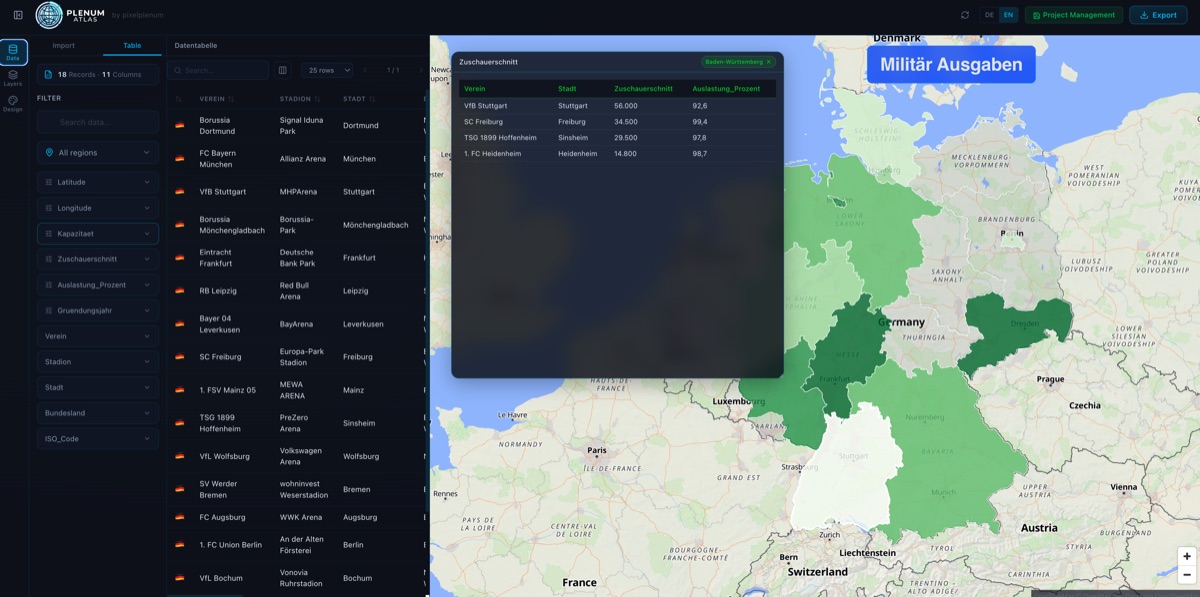
- Pick a calm base map. Plenum Atlas offers 10 map styles – a light or dark minimal style usually lets the data colours stand out best; satellite imagery is great for context but busier.
- Add labels sparingly. A text-label layer can show names or values for the most important regions.
- Tell the story next to the map. Dashboard windows add a data table, bar, line or pie chart or a single KPI value. They react to clicks on the map, so readers can explore the details.
- Think about colour vision. Avoid pure red–green scales; palettes that vary in lightness work for everyone and also survive black-and-white printing.
Step 5: Export and share
When the map is ready, export it as PNG/JPG for slides and social media, as PDF for print, straight into PowerPoint or Word, or as a single, self-contained interactive HTML file that keeps hover tooltips, click filters and dashboard windows working in any browser – even offline.
Common mistakes to avoid
- Unmatched regions. If a country stays grey, its name or code probably doesn't match – switch to ISO codes or fix the spelling.
- Mapping totals. Big countries look important just because they're big. Map per-capita values or use bubbles for totals.
- Too many colour steps. Five to seven distinguishable shades are easier to read than a rainbow.
- Missing context. Always give the map a title, a unit and a source.
Frequently asked questions
Can I make a choropleth map without GIS software?
Yes. Tools like Plenum Atlas include the geographic boundaries, so you only need a spreadsheet with a region column and a value column – no projections, no shapefile preparation.
Which file formats can I use?
Plenum Atlas imports CSV and Excel files (.xlsx and .xls). For custom regions you can additionally upload GeoJSON or a zipped Shapefile.
Can I map German federal states or US states?
Yes. Besides world countries and continents, Plenum Atlas includes European countries, the 16 German federal states and the 50 US states plus Washington D.C. out of the box.
Does my data get uploaded anywhere?
No. Plenum Atlas processes your data locally on your Mac or Windows PC; nothing is sent to a cloud service.