
How to make a bar chart race video
In a bar chart race, bars grow, shrink and overtake each other as time passes – a hugely popular format for rankings such as GDP, population or sports records. Here's how to make one from your own data, right on your iPhone, iPad or Mac.
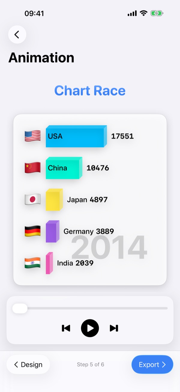
What makes a good bar chart race?
The format works when the ranking changes over time. If the same five items stay in the same order for the whole video, a simple line chart is the better choice. Good candidates are long time series with several contenders: country statistics over decades, brand market shares, streaming numbers, sports tables.
Step 1: Structure the data
The easiest layout is a long table with one row per name and point in time – three columns are enough:
| Country | Year | GDP_Billions_USD |
|---|---|---|
| USA | 2014 | 17550.6 |
| USA | 2015 | 18206.0 |
| China | 2014 | 10476.0 |
| China | 2015 | 11061.6 |
- One name column – the bars (countries, brands, players).
- One time column – years, months or dates, in a consistent format.
- One value column – plain numbers without units.
- Fill the gaps. Missing years make bars jump; fill or interpolate them before importing.
Step 2: Discrete or cumulative?
Decide what each value means. Discrete values are the level at that moment – GDP in a given year, a country's population. Cumulative data adds up period by period – goals scored per season that become career totals, or monthly sales that become a running total. Chart Race supports both, so you can import per-period numbers and let the app accumulate them.
Step 3: Import and preview
Open your CSV file in Chart Race and the animation appears immediately – no rendering wait. Adjust the speed and the number of visible bars until the race has a good rhythm: around 10 bars and a few seconds per year is a solid starting point.
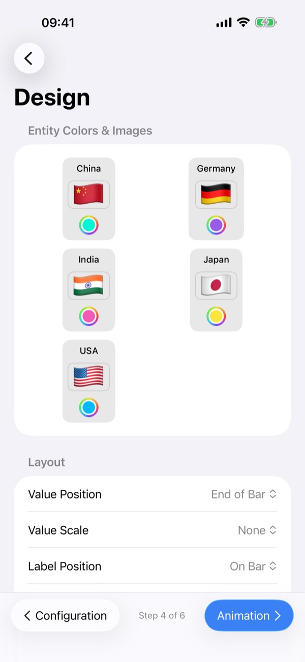
Step 4: Style it
- Give every bar a stable colour so viewers can follow it as it moves.
- Add images to labels – flags or logos make bars recognisable at a glance.
- 2D or 3D? A clean 2D look reads best on small phone screens; the 3D perspective adds drama for intros and thumbnails.
- Show the time prominently so viewers always know which year they're watching.
Step 5: Export for the right platform
Export in landscape 16:9 for YouTube and presentations, or in portrait 9:16 for TikTok, Instagram Reels and YouTube Shorts. Keep short-form videos under a minute: pick the most dramatic period of your data rather than the full history.
Frequently asked questions
Do I need Excel or Python to make a bar chart race?
No. With Chart Race you only need a CSV file with names, points in time and values; the animation and the video export happen in the app.
Can I make a vertical bar chart race for TikTok?
Yes. Chart Race exports portrait 9:16 videos for TikTok, Reels and Shorts as well as landscape 16:9 for YouTube.
Is my data uploaded to a server?
No. Chart Race processes your data on your device; no cloud upload is required.
Is there a free version?
Yes. The free version adds a watermark and limits the number of data rows; a one-time Pro purchase removes both.